I was using Web Plot Digitizer to calculate the area of something in an image. While this works okay, I really wanted a more intuitive way of doing this.
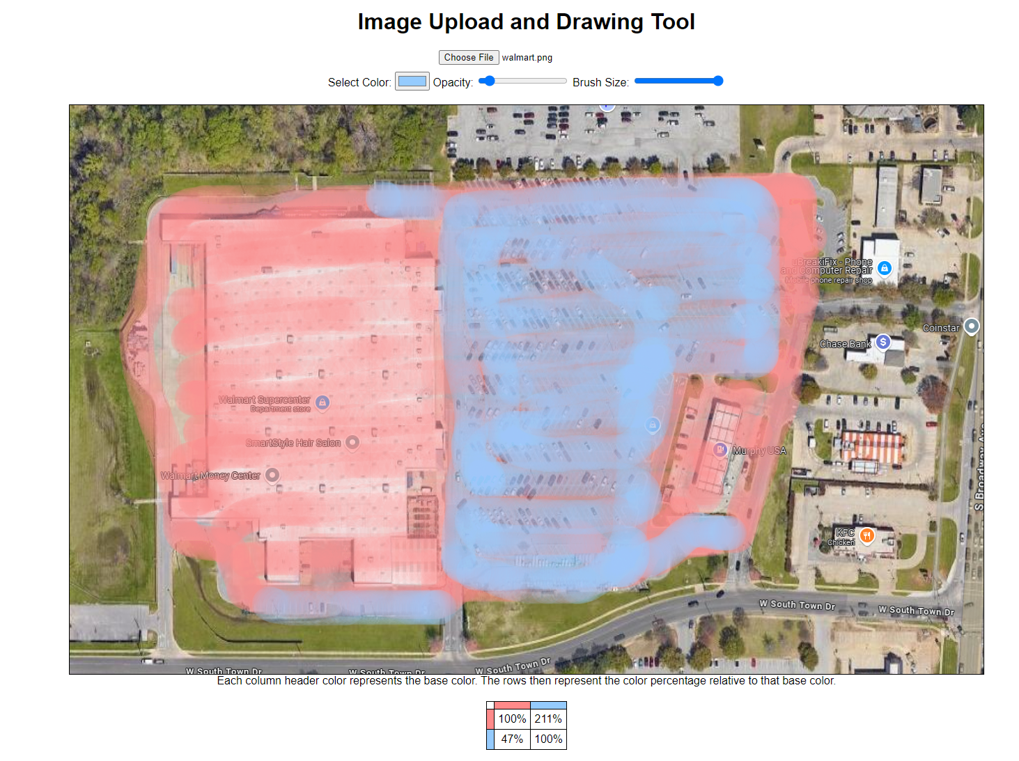
What I wanted was a way to paint one area that paint another area to compare the two areas. This can be used for many things. One case is to compare the total space of a store vs the space taken with parking lots. To get this data, I created Image Area Draw Calc (Yeah, I know it is an awful name). You can draw multiple areas and the areas will be calculated in relation to them. You can also use different opacities, so you can still see the image below it. It might be good to see with an example. Below is what I did for a local walmart. Note that the intensity of the color has no relation to the counting of area. Light coloring is as effective as dark coloring.

What I did was I selected the red color, set the opacity to very low, and draw the whole of walmart’s property. Note that the opacity of the color is related to the drawing speed now, So that the start of the stroke, the opacity is less while the middle of the stroke is more. The strokes are way too gross to be what I am looking for, but it is good for rough estimates. The next step is to select any other arbitrary color and draw with this. Under the image, the matrix describes the relative proportions. The regions don’t care if you color over an existing region. In the matrix, the column colors are the base colors. So for example in our image, red is the first base color. Red relative to red is obviously 100% since 100% of the red regions are red. Below at the blue column, the percentage of 47% represents the proportion of blue relative to red. So, blue is 47% of red. In the context of the image, approximately 47% of the walmart property is parking lot. Now, you need to be careful about definitions about what to paint when making analysis like this. This specific case needs more careful analysis. This is a tool. Tools can be used well and used poorly. This specific case is just an example. Anyways, you can also look at the second column which is using the blue as the base. The first row being red means that the blue is 211% of the red area. Really, this is not useful though. In future work, I will probably just remove the upper diagonal including the diagonal since it is just redundant information ($47\% \approx \frac{1}{211\%}$ ).
So, I need to work on a few other things like making the opacity better. It also does not work on mobile which might be a big deal breaker. It works for my purposes now, so I am not sure that I will put more time into it though. It was just a fun and semi-useful thing to work on for a bit.
You can find the source code here on Github.